

Hey, my name is Ben Somekh! 👋
I value companies that prioritize clarity, take bold bets with intention, and stay relentlessly focused on delivering measurable impact.

✍️ Read some of my stuff at: https://colloquium.substack.com/🌱 Visit my mentor profile on ADPList: https://adplist.org/mentors/ben-somekh
What my colleagues are saying 🗣️


About
I'm a Product manager with a penchant for psychology, innovation, decision-making, and leadership. In the not so distant past, I created films that appeared in 10+ international festivals. Currently, I help companies add value to their users, reduce risk for the business, and enable growth. In my free time, I watch and re-watch The Wire, write fiction, and train with a kettlebell (hint: one of these is not like the others).
What am I excited about right now
Most of what this person or this person think about.I'm also excited about tools that help people in two possible ways:
Learn or practice how to live a better life with themselves, on a mental or spiritual level.
Learn or practice how to live a better life with other people. Mainly by Identifying better ways of allowing people to communicate and share knowledge online and offline.
These categories are legitimately broad, but I'm also a very curious person. 😉
What I’ve been excited about for a while
My curiosity has pulled me in different directions, but here are some topics that keep me interested:
(in no particular order)
Visual Perception
Productivity & Self Improvement
Philosophy (Jewish Philosophy, Neo-Platonism)
Decision-Making/Risk
Leadership
General Psychology
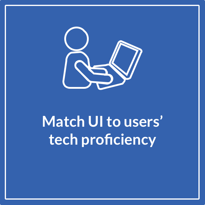
Product Strategy & Growth
Seinfeld :)
Let's get personal
Born and raised in Israel, I immigrated to the U.S. when I was 20. I now live with my wife, our baby by, and our two cats in NYC, Memphis, Austin.


Contact
Best way to contact me?
And also, enjoy this view from Maine that I thought might brighten up the place!
Osow
A Chicago based startup helping truckers and hauling companies speed up their workflows.
Role
Product Designer & Project Manager
Team
3 Designers & Researchers
Remote Client (C-Suite)
Challenges
Platform needs to be adaptable and fit their growing number of tools.
Users need to be able to use their platform with minimal live interaction, in order to save the business time and money
Outcomes
Increased conversion from old platform to new one
Decreased amount of time it takes to onboard new customers
Highlighted functionality to users so they can understand the value
Timeline: 4 weeks (Feb 2020 - Mar 2020)
The Product
Problem it solves
For trucks hauling loads that are either oversized and/or overweight, a specific permit is required in EACH state. Furthermore, each state has its own laws and and often changes its requirements, which makes it hard for truckers and hauling companies to estimate correctly how much would a potential haul cost.
How it does it
Osow's web platform consists of two main tools:Assist: allows users to enter their trip information and immediately receive an overview of costs and their potential profit.Permit: allows users to enter their complete trip information, including vehicle and load information, and request multiple permits at once. Osow will contact relevant states for the permit and will provide all the documentation needed for the users' trip within 2 business days.
Kickoff: Product & Users
Scoping & Stakeholder Interviews
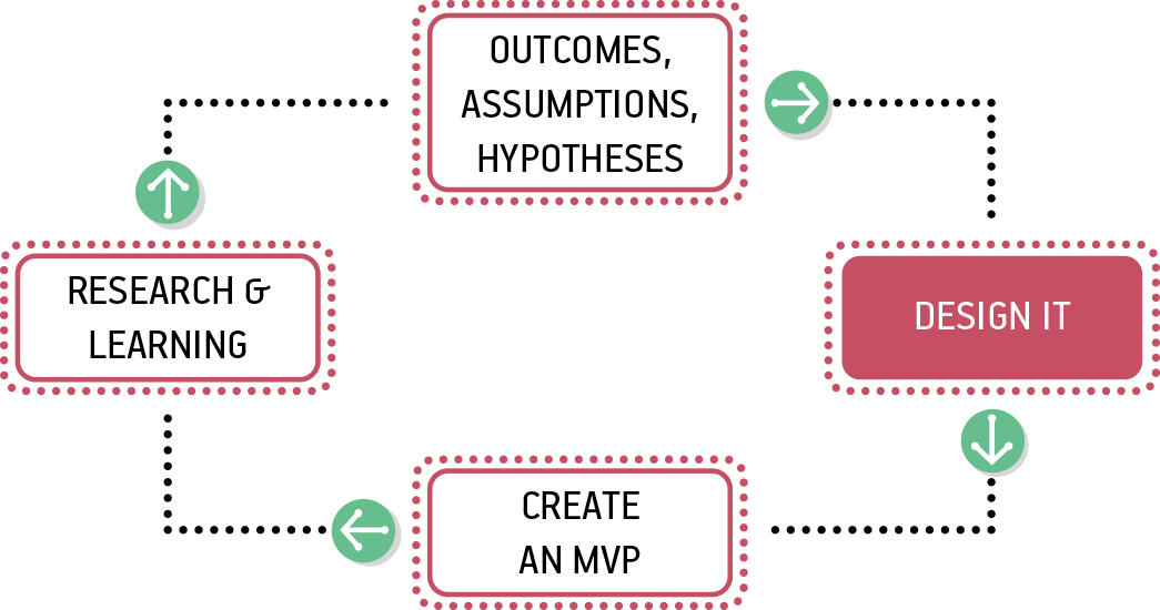
Scoping the project is one of the most important things I do before going into every project. Deciding explicitly what is going to be inside the project and what is not, is super important. We did this with the client as well as collected information regarding their assumptions re: users, product issues, and moreCollecting these assumptions, the client and the team's, is something I learned through Lean UX, and is an activity that helps you take a fresh look at the problems waiting to be solved.
We also compiled a domain research report looking at trends, specific language used by competitors, unique values, market saturation, and more. This helped us understand the sector better but is also useful for framing your solutions later on in the project. The more you know coming in, the more relevant your solutions are when testing.
Usability Testing & User Interviews
Assumptions, hypothesis
Since we had a functioning product and a list of current users our client provided us with, we decided to combine testing the existing product with interviews.
Testing goals:1. Validate earlier client assumptions2. Learn about different user workflows and narrow down main discrepancies between product and existing workflows.

Some of our insights included:
1. Different User segments
Why it matters: Different kind of users, use the product differently. We noticed a difference between the workflows and were able to cluster different users into these 3 groups.1. Individual truckers
2. Back office workers
3. Large fleet companies
2. High satisfaction rate among current users
Why it matters: Knowing what works is almost as important as knowing what doesn't. We noted specific areas where users had no issues with and made a point not to alter them unnecessarily.
Users were having specific issues with the existing product:
Based on the research, these were our takeaways:
Definition & ideation
We were able to define and focus both on users and tools
We predefined the areas we were going to work on: Onboarding, dashboard, Assist tool, and Permit tool.
We also took our three predefined customer segments and assigned each of them a problem statement. This allowed us to adjust our user flows according to the customers, see connections between workflows, and decide on which features to prioritize in our designs.
User Problem Statements
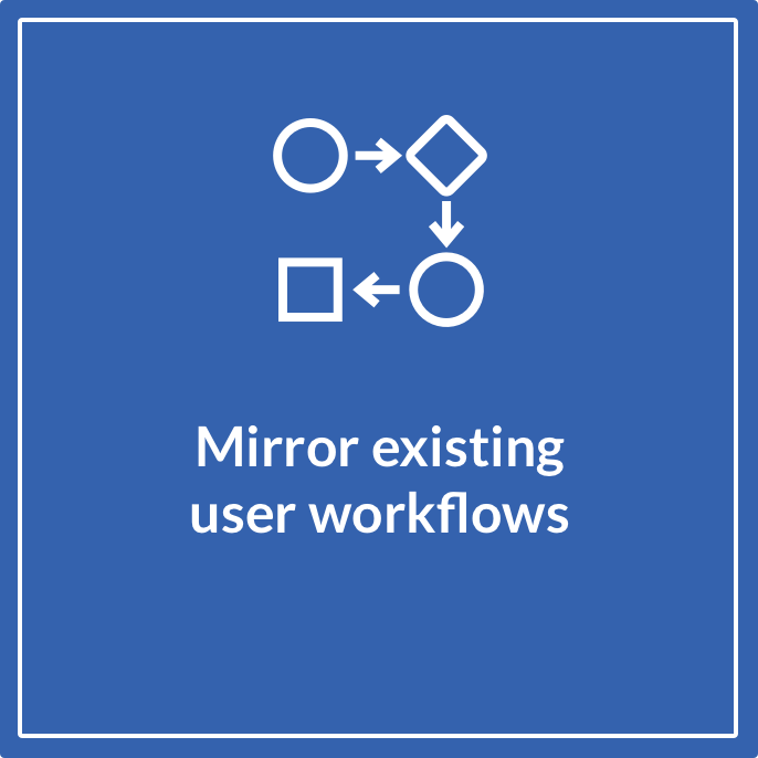
#1
Busy and experienced users need a way to quickly fill in information they have on hand, because they are short on time and they want something efficient that resembles their previous workflows, and that they don’t need to “learn” how to use.
#2
Small/large fleet customers have different load routines and different workflows, and they need actions/workflows highlighted in the product, because the current layout doesn’t inform them about all the functionality and they miss valuable tools they would otherwise use.
#3
New users need a way to know about what the product offers, and how it pertains to their specific business, because currently onboarding takes too long and there is no information about how to use the product as a first time user.
Sketching
It was time for exploring. Once we had the boundaries drawn around us (the product, the problem, the audience, their needs), it was time for creativity. After sketching out multiple ideas, we all came up with 1-2 flows that we felt represented our best ideas.
Dot Voting
I created a remote workspace in Miro, so we can do the dot voting with the client as well. This helped get more perspectives on the designs, and helped the client see how the problems are going to be addressed.


Wireframing
We did two things that helped us, eventually, to come up with two quick prototypes:
Sketching out basic flows on the whiteboard (Breadboarding)
Come up with a design library to work from.
We also decided to focus on three areas: Assist tool, Permit tool, and the onboarding.
Solutions
Since we had multiple designs we wanted to test, we decided to build two prototypes and perform a/b testing.
We not only tested different screens, but also flows:

Adjusting Our Testing Plan
At this point, we also hit a snag with our user list. Not enough users were willing to perform the usability test with us. We did several things to offset this:
Informed the client, and offered possible solutions
Used our network to source backup participants
Provided participants specific with scenarios, characters and stories to have in mind while they were going through the testing
Used UsabilityHub to send out visual test to users who were otherwise unavailable for live testing.
Proposed Solutions
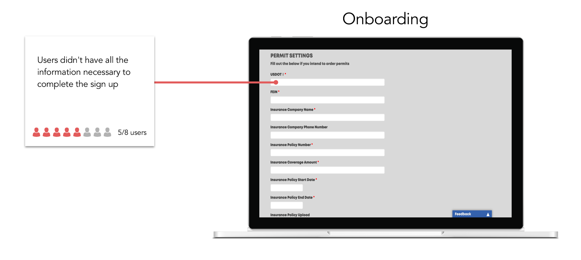
Onboarding/New Users
Make "company info" optional and push it to billing flow
experiment with allowing users to use tools before they create an account
Surface information, including informative empty states, to new users (throughout)
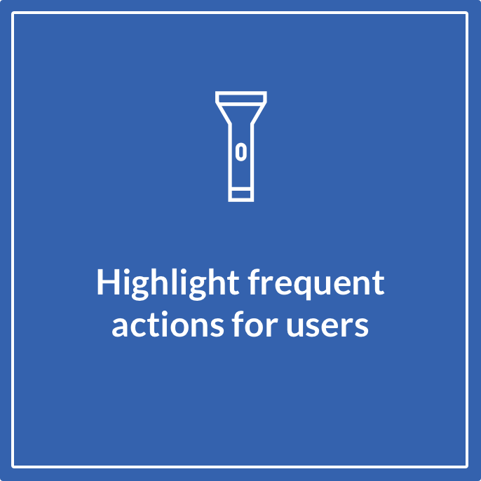
Dashboard
Highlight frequent actions, devote more screen space for them
Un-hide features from users, bring them to the front instead of creating dropdown menus
Add bulk and collaborations actions
Assist Tool
Move the map to the results page
Highlight the tool's value proposition at the top for users
Provide users with a quick view of the main details they are likely to want, before showing them the full results
Add bulk and collaborations actions
Permit Tool
Section the form into different pages
Keep users informed about their progress
Allow users to add missing inputs (inevitable edge cases)
Validation
Remote Testing
In our in-person tests and our UsabilityHub questionnaires that we sent out we asked participants to interact with the two different flows. This gave us a chance to validate which design, and which specific features worked the best.This in turn, allowed us to converge to a final prototype which we delivered to the client at the end of the project.
During the first iteration, we used the existing design system and color palette Osow provided us with. This sped up the first design iteration.
Converging to a Final Design
Some of the solutions we proposed were clearly validated, but with others, we had to either marge or tweak some of our changes:
Signup
Before and after


Dashboard
Before and after


Assist
Before and after


Permit
Before and after


And here's a closer look at some of the designs, and how we got there.
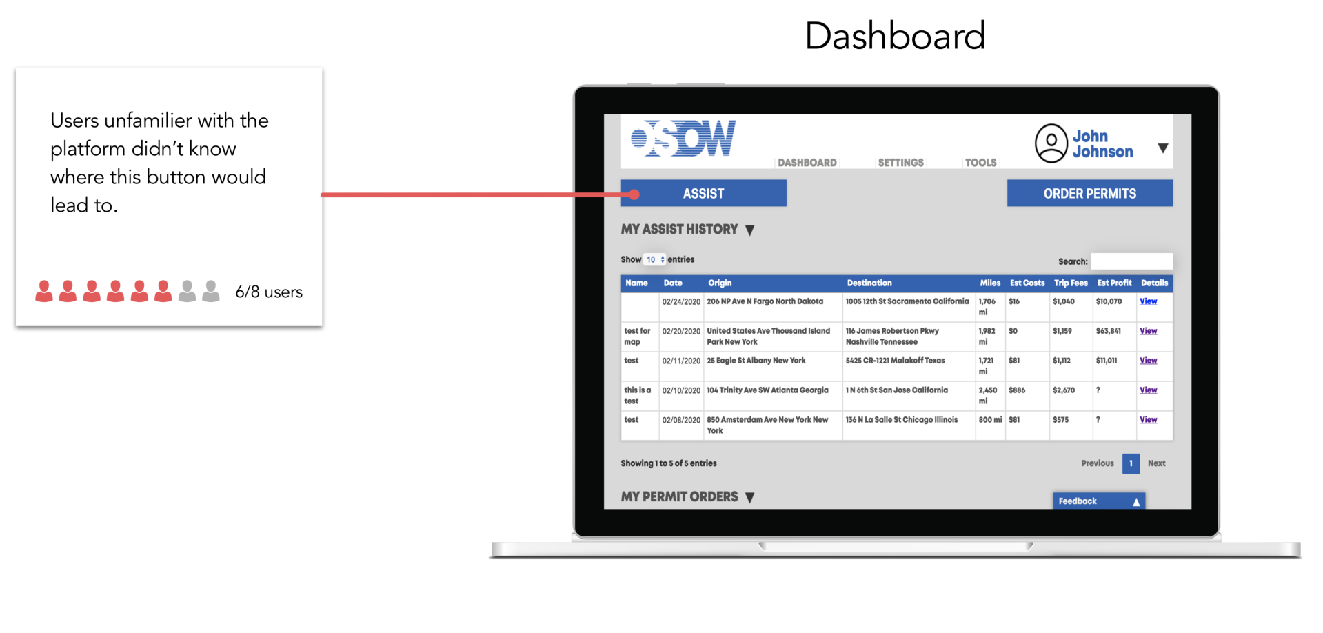
Dashboard

User/Biz Pain points
Users couldn't find all the tools available through the dashboard.
Biz was having trouble integrating new functionality with current framework.
Users & Biz reported dissatisfaction with current visual layout.
Opportunities
Add collaboration actions to match user workflows (share, print, download).
Build visual hierarchy.
Surface useful tools that users aren't aware of with clear labeling.

Actions taken
Reconstructed design system based on atomic design and Tailwind UI.
Added new buttons, inputs, labels, tables, dividers, cards, etc.
Removed footer once users are logged in.
Added actions under each table
Surfaced quick links and resources that users weren't aware of.
Impact created
8/8 users were able to navigate to the Assist tool, as opposed to 2/8 before.
Reduced signup friction, and allowed for more user acquisition without manual onboarding.
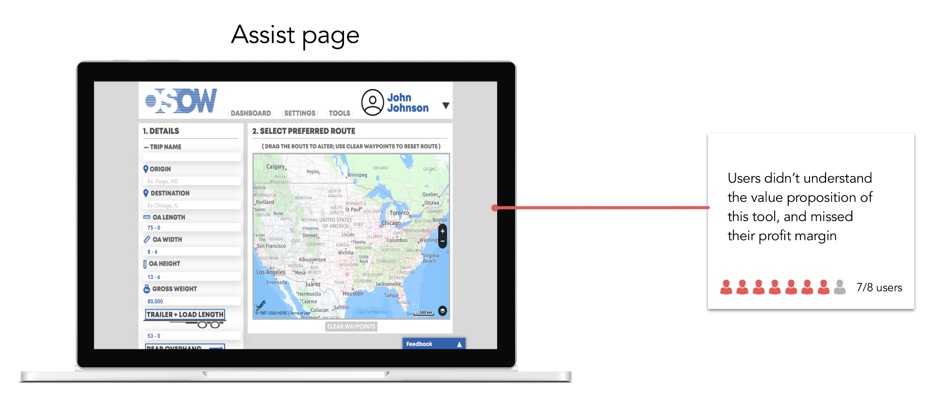
Assist

User/Biz Pain points
Biz has been seeing low adoption of the assist tool.
Users were confused by the tool's value proposition (calculating your trip's profit) and often missed it.
Users had no way to share results with coworkers.
Opportunities
Add collaboration actions to match user workflows (share, print, download).
Emphasize the tool's value proposition on top of page.
Allow for quick re-calculation to match users' real workflow as observed in research.

Actions taken
Used new design system, especially for the table.
Color labeled results.
Removed footer.
Emphasized profit calculation on top of page.
Separated full results from main results to declutter the layout.
Added collaboration actions.
Impact created
8/8 users successfully navigated from Assist tool to pay for permits.
Enabled sharing of documentation, boosting adoption of large org users.
Handoff
Here is what we delivered to the client at the end of the project:
Final prototype
Annotated wireframes
A document with all the features we implemented in both prototypes (for Osow's future backlog)
Glad you stuck around :).I'm available for full-time or consulting work.
Glad you stuck around :).I'm available for full-time or consulting work.
Winkel
A mobile grocery app that helps you plan meals for the week, stay within your budget, and eat healthy.
My Role
Product Designer
Timeline
4 Weeks (Sep 2019 - Oct 2019)
Tools
Trello, Coda, Miro, Sketch, InVision
My Process
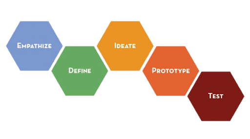
This was one of my first UX projects, so it was important for me to follow a clear process. I used Stanford D. Design process, and Lean thinking. I combined these by going through the whole process, creating a paper prototype MVP, tested it, and then repeated the process again.
Market Research
User Interviews
Problem Definition
Paper prototype
Iteration and Wireframes
Brand Colors and Typography
Hi-Fidelity Screens
Usability Testing
Problem Space
The Project Brief
The challenge was fairly simple. Improve the experience of users shopping for groceries online by designing a mobile first experience.There were two implicit assumptions here that I set out to validate:
The current applications don't do a good enough job, and there's space for improvement
Online grocery shopping is a mobile first experience.
Understanding the market & the need
To put myself in the best position coming up with a relevant solution, I went about discovering two things:
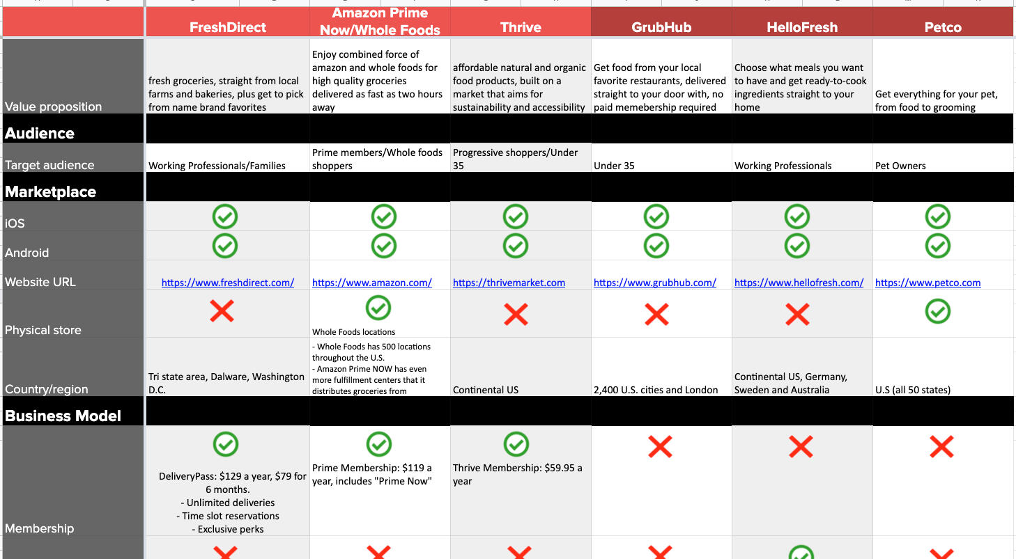
The Market who are the competitors out there?
The Need do people really need another grocery app? What are their specific pain points and what are they motivated from?
Competitive Analysis
Researching existing platforms gave me the opportunity to learn what is being done well and also what is not being addressed. I further validated this in my domain research.Some important insights I carried over validate with users are:
people using online grocery still go to the physical store as much as people who don't use online groceries at all.
Existing platforms use the standard retail approach to online shopping, but don't let users create grocery lists or favorite items
Existing platforms offer discounts and savings, but don't offer other ways financial features, like letting users sort by budget
Understanding Users
User interviews
Actions & words
I received 3 complete user interviews. I sifted through the transcripts and wrote all the goals, motivations, pain points and any form of behavior I could find.Based on a Journey map I constructed, I also sorted through the behaviors that I found


Key Insights from interviews:
1. Money plays a significant role
90% of users
Why it matters: Other than physical location, cost is the most important factor participants considered when choosing where to shop. Important to consider how we can help users be cost effective.
2. Last minute runs to the store are a major yet consistent pain point
100% of users
Why it matters: Even organized participants mentioned they had to inevitably restock on groceries. This hints at a space for optimization. We should consider how to improve the predictability of grocery consumption for users
Empathizing with Users
Persona
Creating a persona helped contextualized the most important goals, frustrations, and behaviors I collected from research.

Problem Statement & User Stories
This gave me a better sense of the major problems users are having.User stories are also important for the scope of the project, because they ground the problems into specific solutions I might offer to users. They hint at the features I will implement for the future and gave me a starting point for my task flows and eventual app map.

Ideation
Coming up with ideas
Once I had the boundaries and the potential pathways for my solutions, I could safely get creative :)
Low-fi Sketching
I used the 6-8-5 method to generate as many ideas as I could.

Align solutions to stories
I didn't want to sketch full flows, I instead opted for creating specific screens that would could give me, and my future testers, a sense of how this design will solve their problems.

Idea Validation & Prioritization
Before moving forward with a specific prototype, though, I wanted to make sure I'm focusing on the highest impact, highest reach features. Basically, I wanted to focus on the 20% ideas that would give users the 80% of value. This while keeping in mind innovation and technical feasibility.

These are the main features I decided to focus on:
1. Let users set a specific budget
Pain point it touches on: It's hard for users to see how much they spend on groceries, which causes frustration, which in turn causes them to avoid grocery shopping, especially online.
2. Items are sorted by day + meal
Pain point it touches on: I was inspired by the YNAB approach for this feature. People don't buy groceries in a vacuum, they buy them for specific meals. The app will allow users to shop for specific meals in specific days and will help them get organized.
3. Users can share their list with collaborators
Pain point it touches on: Most of the research participants were part of a multi-person household. This means they had to decide together. The app will allow cart sharing, collaborative budget adjustment, and more to facilitate multi-user accounts.
Paper prototype & 1st round of feedback


I decided to test out a paper prototype for several reasons. Key reasons were:
Validate my main features before I commit to more work
Test out the different flows and see how they connect
Get quick impressions from people close to me
Ingesting Feedback & moving forward
✅
I received great feedback from participants, either explicitly or by watching them interact with the prototype
The budget screen needed to be more clear about what each number means.
❌
Offering users collaboration and joint accounts was beyond my scope
Even in the paper prototype I struggled to produce enough screen to complete all the flows for the collaboration feature. Since I had enough successful features to continue with, I put the collaboration feature on a backlog.
Wireframes
Based on the feedback I got and my initial designs, I started wireframing
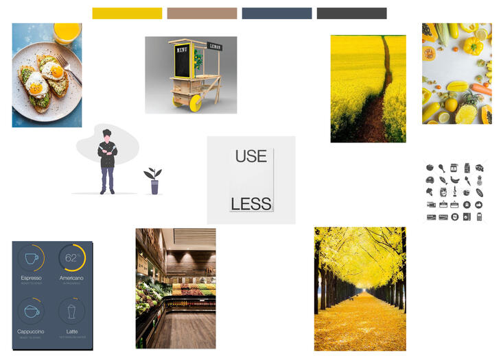
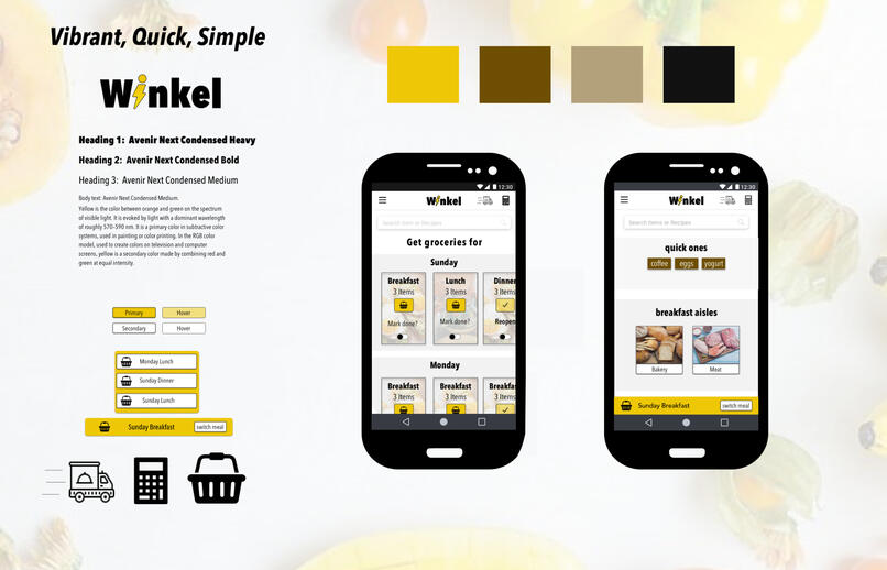
Color, Typography and Iconography
I went into a quick round of looking for a cohesive theme for my Hi-Fi designs. I also added typography and Iconography.
Hi-Fidelity Designs
Let's walk through some of the main features I tested.
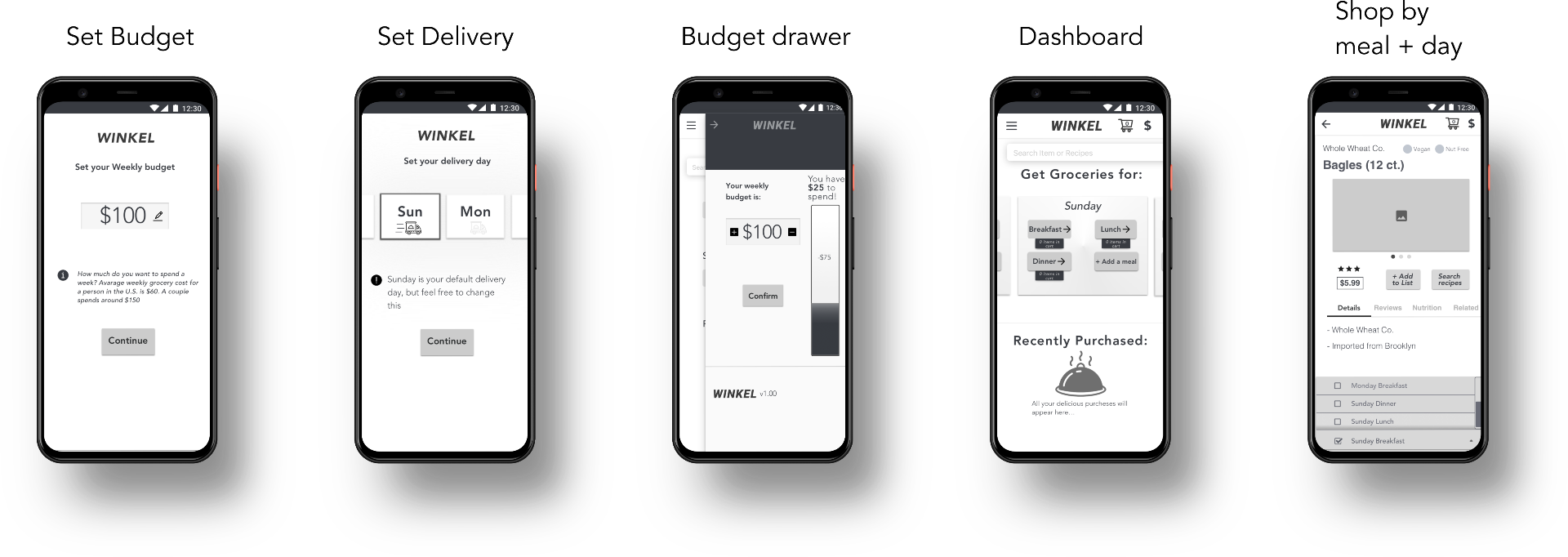
Easy and informative onboarding
Since my app featured a workflow different from other grocery apps out there, I wanted to inform users about how the app works.

Sorting groceries into days + meals
During research, users were having trouble foreseeing how many groceries they will need. I designed this workflow to address this.

Automatic grocery sorting
Using a dropdown, users could easily change which meal or day they are shopping for.

Budget drawer
Pain point: Users mentioned money to be one of their top priorities. Allowing users to set their budget promotes healthy gamification.

InVision Prototype
After finishing up the mockups in Sketch, I created a prototype in InVision.
Glad you stuck around :).I'm available for full-time or consulting work. Feel free to contact me below.
Osow (Voice App)
Voice skills that allow Osow's users to estimate potential trips, share trip details between office and drivers and make faster decisions.
My Role
Design & Build
Timeline
2 Weeks (Feb 2020)
Project Context
During my time working on Osow's core product, I learned about a new tool (VoiceFlow) that allows you to create voice apps. I took the lead on this side project, and within two weeks presented the client 3 separate voice skills that they could integrate into their main product.
Process
Researching
First, I found out about the need for this kind of solution. I took advantage of the interviews we were already conducting for the core product and got feedback from users to validate a need for voice solutions.
Shaping
I wanted this to be tengible. In addition to sketching flows, I mapped out a backend proccess for each flow, which meant each voice skill was deployable if not fully scalable.
Building
I used VoiceFlow to create the voice skills and Zapier and Google Sheets as the back-end to collect inputs.
Skill #1: Estimate a potential trip's cost and profit
Use Case
A segment of Osow's users are independent truckers. This means they handle bidding on potential jobs (trips), pre-planning trips, and executing them (driving). Being able to find out quickly if a potential trip is profitable, will enhance independent trucker's time management.
Flow
This skill uses the same inputs from the Assist Tool in the core web product, but with adjustments for better voice UX.What does an adjustment mean? Here's the skeleton flow for this skill:
Build
I created the prototype using VoiceFlow. I also provided Osow with two ways of going about creating an MVP:
Faster to develop, slower for users Accomplished by mapping the inputs onto a google sheet using Zapier, and providing an estimate to the user after the fact. Response here would depend on how prompt the business is. Once you get the inputs on the google sheet, you could push a response (email, voice, etc) as fast as you want.
Slower to develop, seamless for users Since inputs are the same as in the web product, user voice inputs are captured by an API, calculated, and an estimate is provided on the spot.
Here's the skill in action:
Glad you stuck around :).I'm available for full-time or consulting work. Feel free to contact me below.
RtO App
An internal application for businesses returning to in-office work.
Role
Product Designer
Team
CEO
Product Manager
Engineering team
In June, I started working with Fliplet on designing custom applications that their clients could use internally.Some of the mockups for our first project, the Return to Office app, are below.
*If you're looking for more than visual design, check out my work on Osow's web platform


Glad you stuck around :).I'm available for full-time or consulting work. Feel free to contact me below.